Accession Number
149858
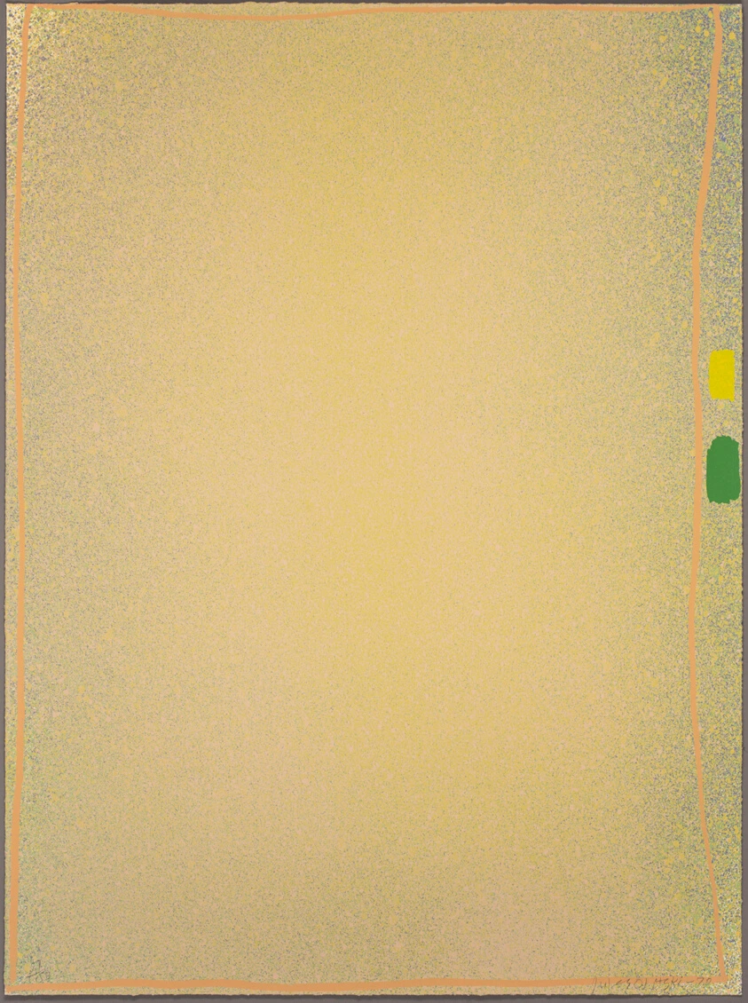
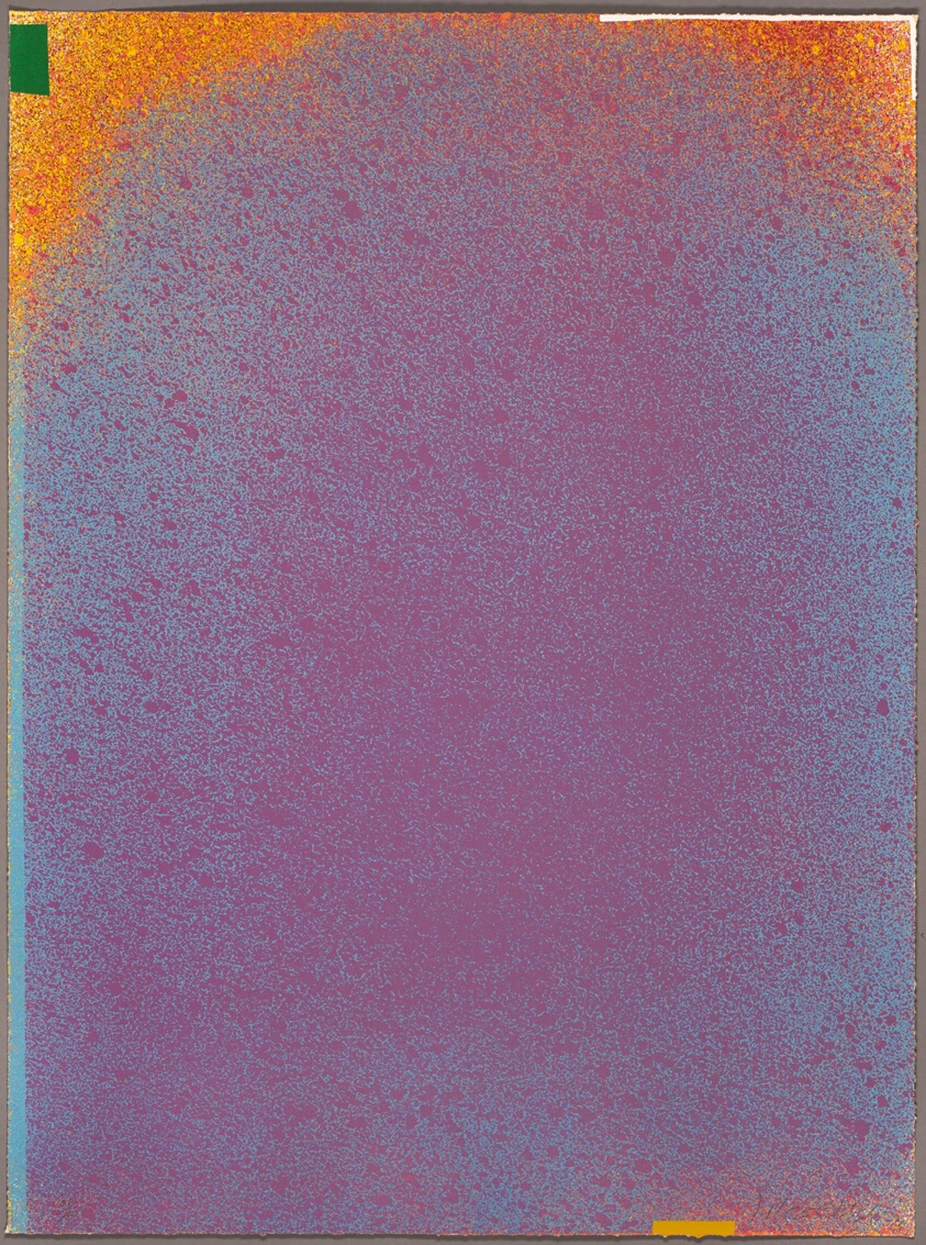
Medium
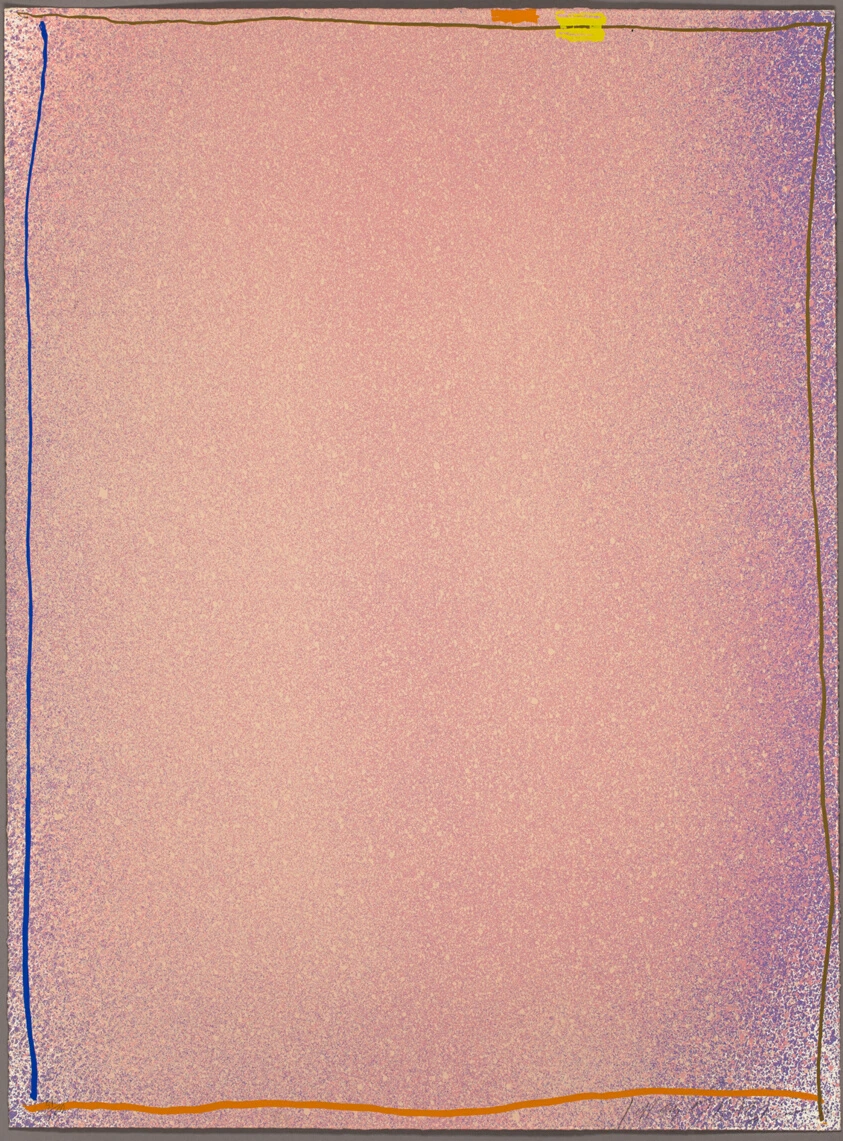
Color screenprint in pink/blue with orange, tan and yellow on ivory wove paper
Dimensions
Sheet: 88.5 × 66 cm (34 7/8 × 26 in.)
Classification
screenprint
Credit Line
Bequest of Maxine Kunstadter
Background & Context
Background Story
Jules Olitskis Graphics Suite #1 from 1970 is a color screenprint that exemplifies the artists contribution to Post-Painterly Abstraction and Color Field painting, demonstrating the chromatic brilliance and atmospheric depth that he achieved in both his paintings and his prints. Olitski, who emerged in the 1960s as one of the leading figures of Color Field painting, developed a technique of spraying thin layers of acrylic paint onto unsized canvas that produced atmospheric fields of color with no visible brushwork and no focal point, creating paintings that seemed to be made of colored light rather than pigment. The screenprint medium, with its capacity for flat, even areas of color and precise registration, allowed Olitski to translate his atmospheric paintings into a print format that preserved their chromatic intensity while adding the crisp edges and clean boundaries that distinguish screenprints from the sprayed paintings. The color scheme of pink and blue with orange, tan, and yellow creates a chromatic harmony that is characteristic of Olitskis best work, in which colors interact at their edges to produce optical effects that are more than the sum of their individual hues. The year 1970 places this print in the period when Olitski was at the height of his reputation, having been selected by Clement Greenberg as one of the most important painters of his generation in the 1964 Post-Painterly Abstraction exhibition that defined the movement.
Cultural Impact
Olitskis screenprints are significant contributions to the history of Color Field printmaking, demonstrating that the atmospheric effects of his sprayed paintings could be translated into the precise medium of screenprint without loss of chromatic intensity. Graphics Suite #1 influenced the development of post-painterly printmaking and the broader tradition of color-based abstraction.
Why It Matters
A 1970 color screenprint by Olitski in pink/blue with orange, tan and yellow, translating the atmospheric chromatic brilliance of his Color Field paintings into the precise medium of screenprint with optical edge effects.