Accession Number
149859
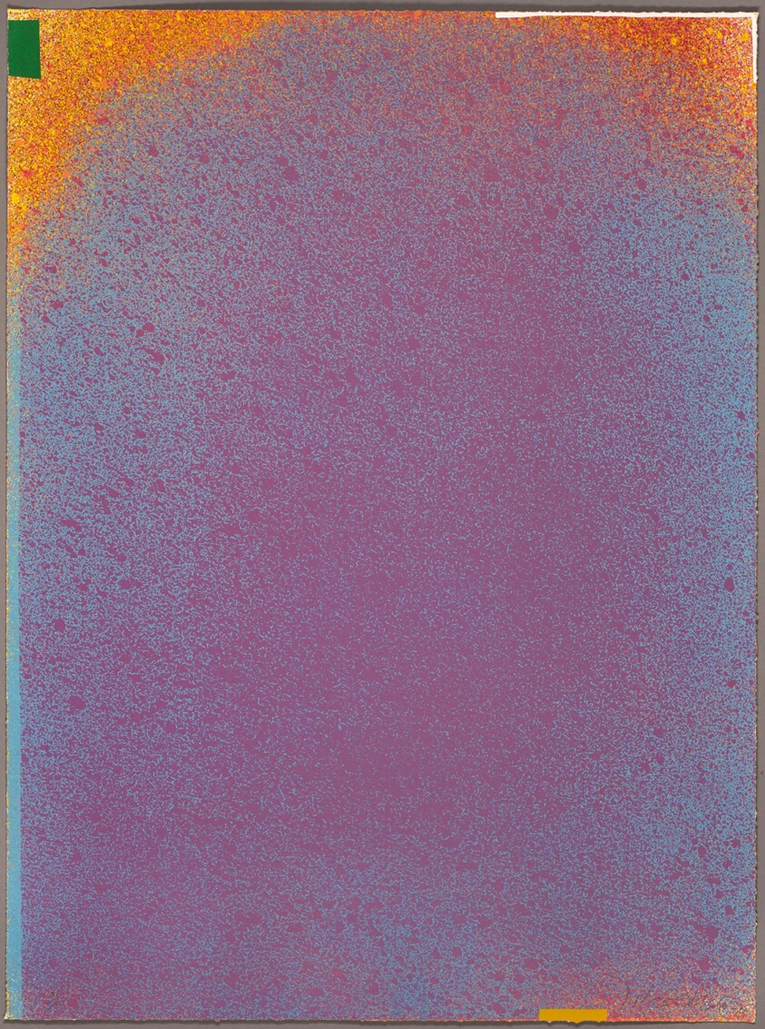
Medium
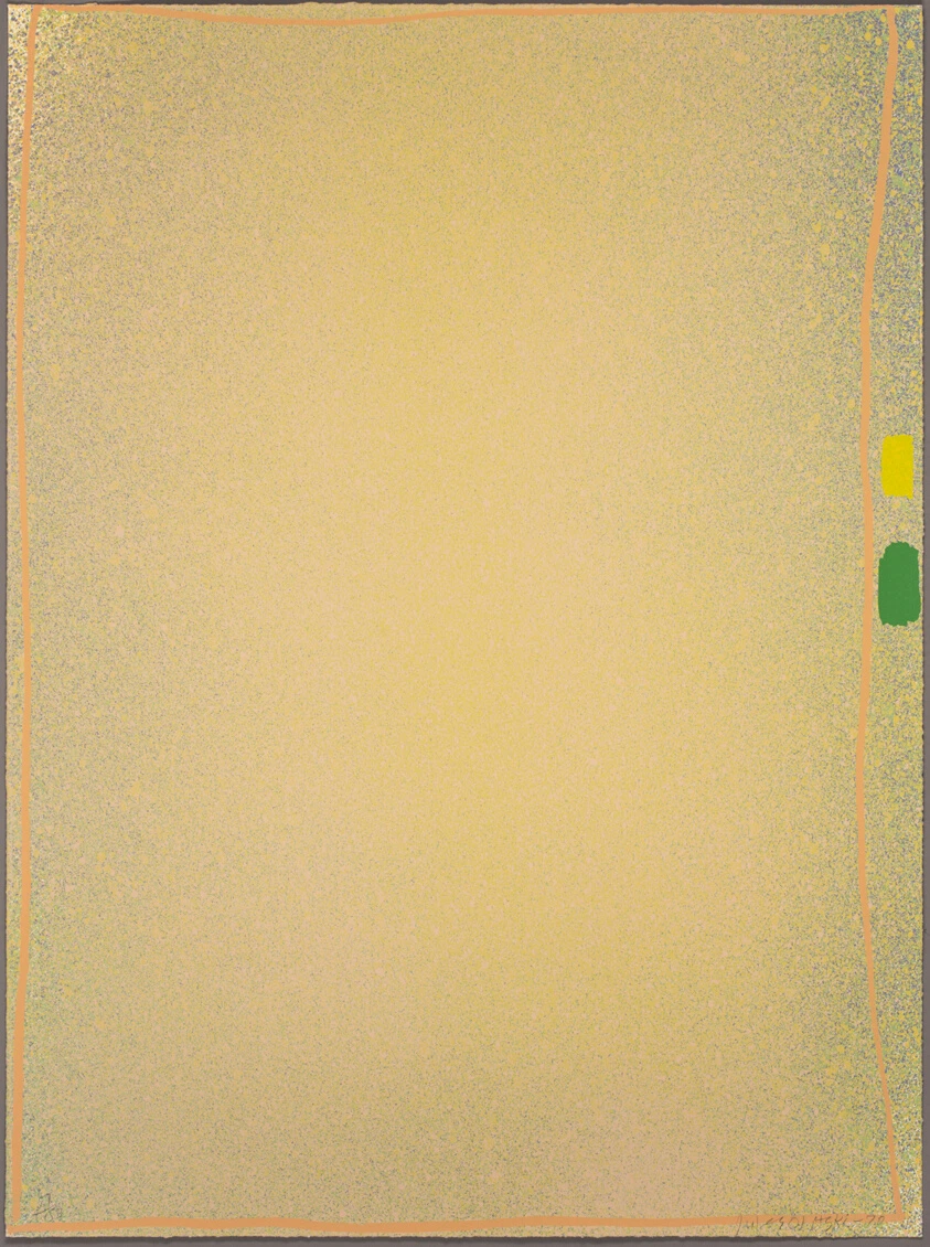
Color screenprint in yellow/green with flesh on ivory wove paper
Dimensions
Sheet: 88.5 × 66 cm (34 7/8 × 26 in.)
Classification
screenprint
Credit Line
Bequest of Maxine Kunstadter
Background & Context
Background Story
"Graphics Suite #1" is a 1970 color screenprint by Jules Olitski that captures the Russian-American Color Field painter in his most graphic and technically experimental mode, the image showing a field of yellow and green with flesh tones rendered with the bold, flat areas of color that the screenprint medium made possible. The composition is a large screenprint—88.5 × 66 centimeters—showing a color field that suggests both the stained-canvas paintings of Olitski's earlier work and the new possibilities of the print medium, the screenprint creating a surface of extraordinary clarity and flatness that contrasts with the depth and atmosphere of the paintings. The 1970 date places this work in the period of Olitski's exploration of printmaking as an extension of his painting practice, the screenprint demonstrating both his mastery of the new medium and his continued commitment to the exploration of color and surface. Art historians have connected this print to the broader tradition of the color-field print in modern art, from the lithographs of Helen Frankenthaler to the screenprints of Kenneth Noland, noting that Olitski's treatment is more focused on the atmospheric effects and the optical depth, the translation of the stained-canvas technique into the flat medium of the screenprint, than the graphic precision or the chromatic intensity of these other traditions.
Cultural Impact
This 1970 screenprint made color-field graphic translation atmospherically flat through large 88cm yellow-green-flesh bold clarity, using printmaking exploration to extend stained-canvas optical depth into screenprint medium beyond Frankenthaler lithographic precision.
Why It Matters
It matters because Olitski printed color onto paper and made the screen feel like it was still breathing from the canvas—proving that even flat ink could hold depth if the yellow was bright enough.